Honeycomb has once again expanded with a new chart: fdom.
Fdom
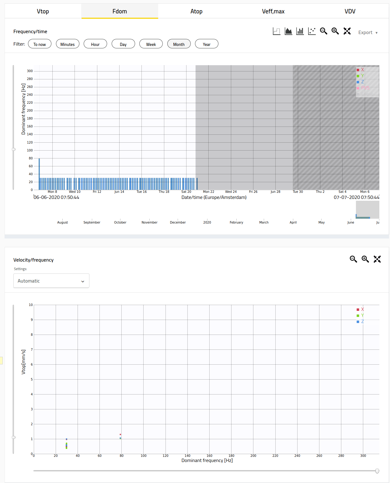
The fdom graph shows the dominant frequency versus the time. To view this graph, please go to Honeycomb, click on 'Graphs' in the menu, and then on the tab 'fdom.' By viewing the fdom graph, you can quickly find out which environmental influences, such as a source on the construction site, are causing a vibration. For example, vibrating a sheet pile wall gives a different frequency than pile driving. In the event of exceedances on the construction site, you can then very specifically identify the source of vibration and intervene if necessary. The graph looks like this: